Another remaster that misses the point
Today Blizzard announced remasters of its classic fantasy real-time strategy hits Warcraft I&II, the games that put it on the map in the distant, functional past of the ‘90s. I should be celebrating; the second Warcraft as unequivocally my favorite game as a young child. I spent God only knows how many hundreds of hours playing it, and even He eventually got bored of watching me make my own horrible little maps and walked away. These remasters, though? They ain’t it.
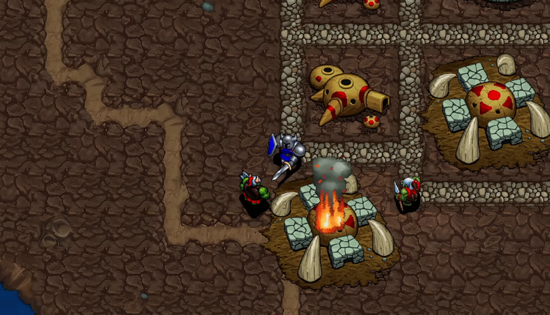
I’ll preface this by saying that I’m very glad these classics remain playable. I’m sure Blizzard’s making a pretty penny off doing so, but at least it’s keeping its history alive. That said, I will be playing these re-releases with the new graphics turned off, because just look at them:
Warcraft Remastered Battle Chest Launch Trailer
The art looks basic and generic where the original pixels inspired imagination, letting your mind fill in the gaps of these units’ physical features. Some, like Ogres and Ogre Magi, appeared almost photorealistic to young me, who sought to recreate them (over and over and over) in drawings and other, larger-scale art projects. In trying to more fully inhabit this universe whose collection of Little Guys inspired me to dare to dream, I constructed life-sized (relative to an eight-year-old) paper dolls of nearly every unit in the game. It was my Everest, entirely because – again – the original game left room for interpretation.
Now admittedly, I’m no longer a small child fueled entirely by starry-eyed wonder, and that’s definitely part of the problem. But Warcraft’s original look was a product of its limitations, and trying to pave over that with plastic-y sheen is a mistake. I don’t know who the new graphics are for – I doubt these old games are going to lure in many new players, especially with art that looks like it belongs in a vastly less-intricate game than Warcraft – but it’s certainly not me.
Yikes; whatever I expected from the remasters - this ain’t it.
The original C&C remaster did a similar graphics upscale, but they at least managed to at least mostly pull it off.
Given they could have potentially rasterised WOW assets to provide a cohesive feel to players, this is just a total ball-drop.
The best remaster was D2R. They made it look EXACTLY like my imagination did back in 2001. It looks incredible.
I think it’s another studio who did D2R, hence the top quality. Blizzard can’t pull that off anymore…
Vicarious Visions’ team for that game needs the equivalent of an Academy Award for what they achieved (and no, I don’t mean Geoff Keighley’s flatulence).
Hahahaha could not agree with you more. When I started it, I was blown away at how EXACTLY LIKE MY IMAGINATION it was.
Literally my only complaint is the Amazon’s model. More svelte in my mind, less… «hand waves» that.
Completely understand where you’re coming from! It’s not terrible but I also had a bit of a different char in my imagination.
Weird thought: I never realized the paladin was black when I was young, but at that time in my life I just didn’t really realize people were different colours because I grew up with a wide gamut of skin colours… when I saw the remake I was like “oh yeah! That tracks!”
The sorc was exactly what I saw when I played as a kid. That was my most played char (under paladin) and she was exactly what my brain said she was.
D2 always looked like shit to me. D2R is the first time that game has been playable for me. Especially with wide screen support and the ability to bind quick cast keys. D2R is top tier.
D2 looked amazing to me but I was on a 640x480 CRT in 2000-2001, so my little imagination put it all together. But damn shit fuck, D2R was done SO WELL.
Even back in the day I felt it was too cramped and awkward. I was more of a starcraft kid.
I loved StarCraft but Diablo REALLY brought me to imagination town. The graphics were such shit but the world was so huge and dark and deep, I loved Diablo sooooo much when I was young. I was just flabbergasted by how much D2R looked like what I had imagined. I went back to the original graphics settings (with filters to make it traditional) and it was HORRIBLE. but as a kid… I was so enthralled.
the “original graphics” settings in D2:R are far worse than what D2 actually looked like. I dont know exactly whats wrong with it, but if you actually have D2 and run it, it looks much better.
Oh you’re not wrong! There’s a special filter you can enable in settings that makes it look more true to what you would have seen on a CRT monitor. When first switched to original settings I was like “absolutely no way it was this shitty” hahahaha
I swear I played D2 at 800x600 - was that enabled in the expansion pack?
You’re 100% correct! I upgraded later, but my fam had a horrid Celeron machine for most of my life and it needed low rez to play well. ATI RAGE II I believe.
Wow, they made Warcraft look like a flash game…
They really did. Even got some Doralingus & Associates vibes from some of these.
That’s what the remaster looks like? That looks like total dog shit. I’ve seen better looking flash games, back when those were still a thing, before all the flash game makers ported and enshitified their once free games and made them P2W mobile apps or worse, charge for them on steam. I’m looking at you, Bloons trash.
Given how much Bloons sells for (something like 1USD?), I can’t say I’m not getting my money’s worth. The devs do have to get fed somehow.
Btd6 is the most well maintained td game out there, super competitive, and you pay like 1 dollar once and can have literally everything unlocked. You only pay for cheats to use in single player. It is one the best monetization I have seen in a game.
But you do you, I guess
Amazing how they managed to make it look worse.
Going to be blunt, looks like they took the original assets and put them thru an AI to with the prompt of “upscale these in the art style of Overwatch and Fortnite”.
It really does look like AI upscaling
What in the ogre loving fuck is this shit
Age of empires 2 definitive set the standard for RTS remakes 5 years ago. This is nowhere close
Ye gods, that’s bloody hideous. Throw a CRT filter over that, at the very least!
I refuse to click links of articles written from Grayson, a “journalist” that even on the niche games reporting field managed to break every single item of the journalism code of ethics https://www.spj.org/ethicscode.asp
Boycott bloggers stealing jobs from real journalists.
Get your unwashed gamergate ass out of here.
Lol, that’s rich coming from an enabler of genocide.
As if I have any control over genocide. I voted against the fascist, at least.
You could only vote for fascists. One personable, one arse-hole, both as fascist as they come.
An unironic “both sides”. How original.
I have no intentions of looking at your profile, so I’ll assume you’re joking. Because I prefer that option.
In either case, one of those candidates will be worse for Palestinians, LGBTQ folks, women, the climate, etc… I actually care about those groups and causes.
Lol, quite literally this week Biden went back on his word on the export block of weapons to Israel. From the outside looking in, there’s no difference.
So even if I were to grant that on Israel/Palestine they were no different (which I don’t), we’re going to throw all of those other groups and causes under the bus?
Well, this took a quick turn into Godwin’s Law faster than I’ve ever seen.
I don’t know anything about Grayson or why someone would have an issue with him, but you’ve made it very clear very quickly that you’re not providing view points worth looking into, so thank you for that.
Not only do you not know what Goodwin’s law is, you took time to reply to a worthless take? How little do you value your time and opinions that you’d go out of your way to deride mine?
you took time to reply to a worthless take? How little do you value your time and opinions that you’d go out of your way to deride mine?
No u


