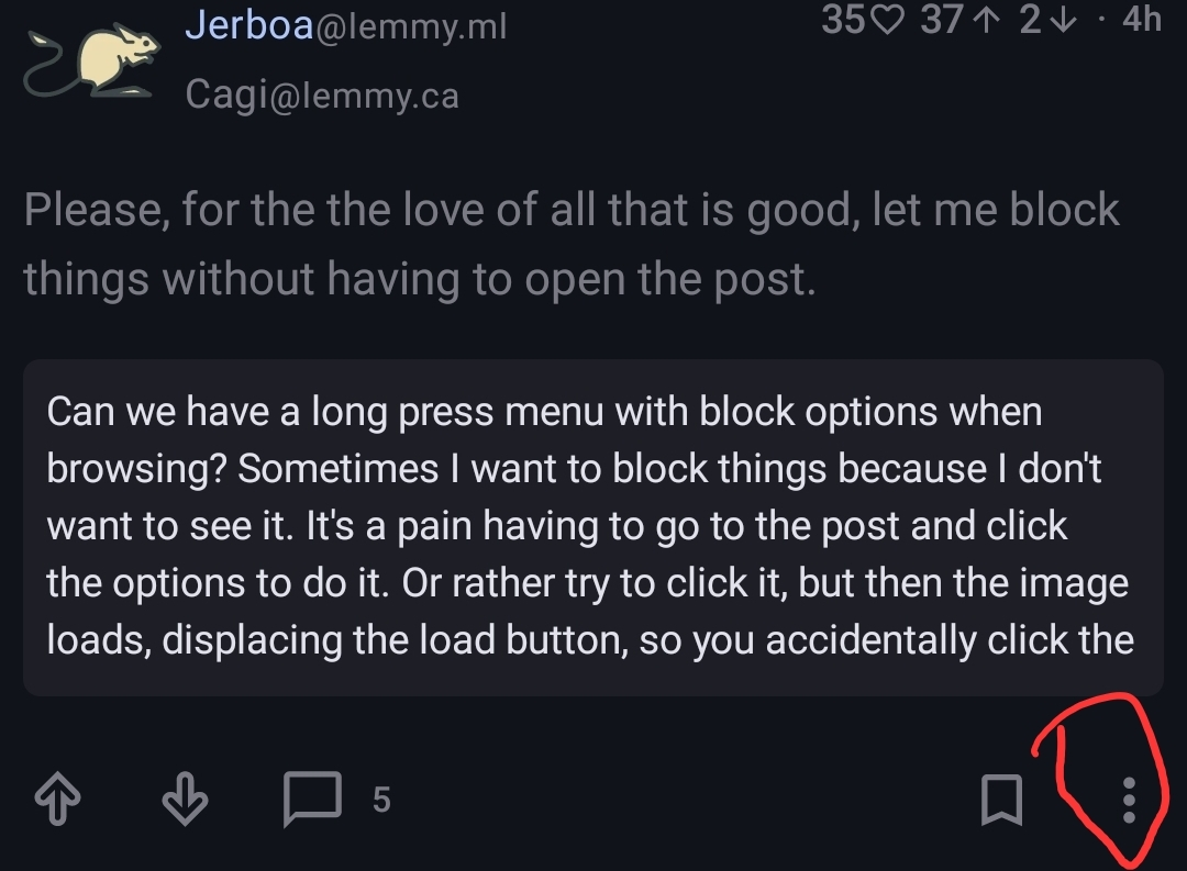
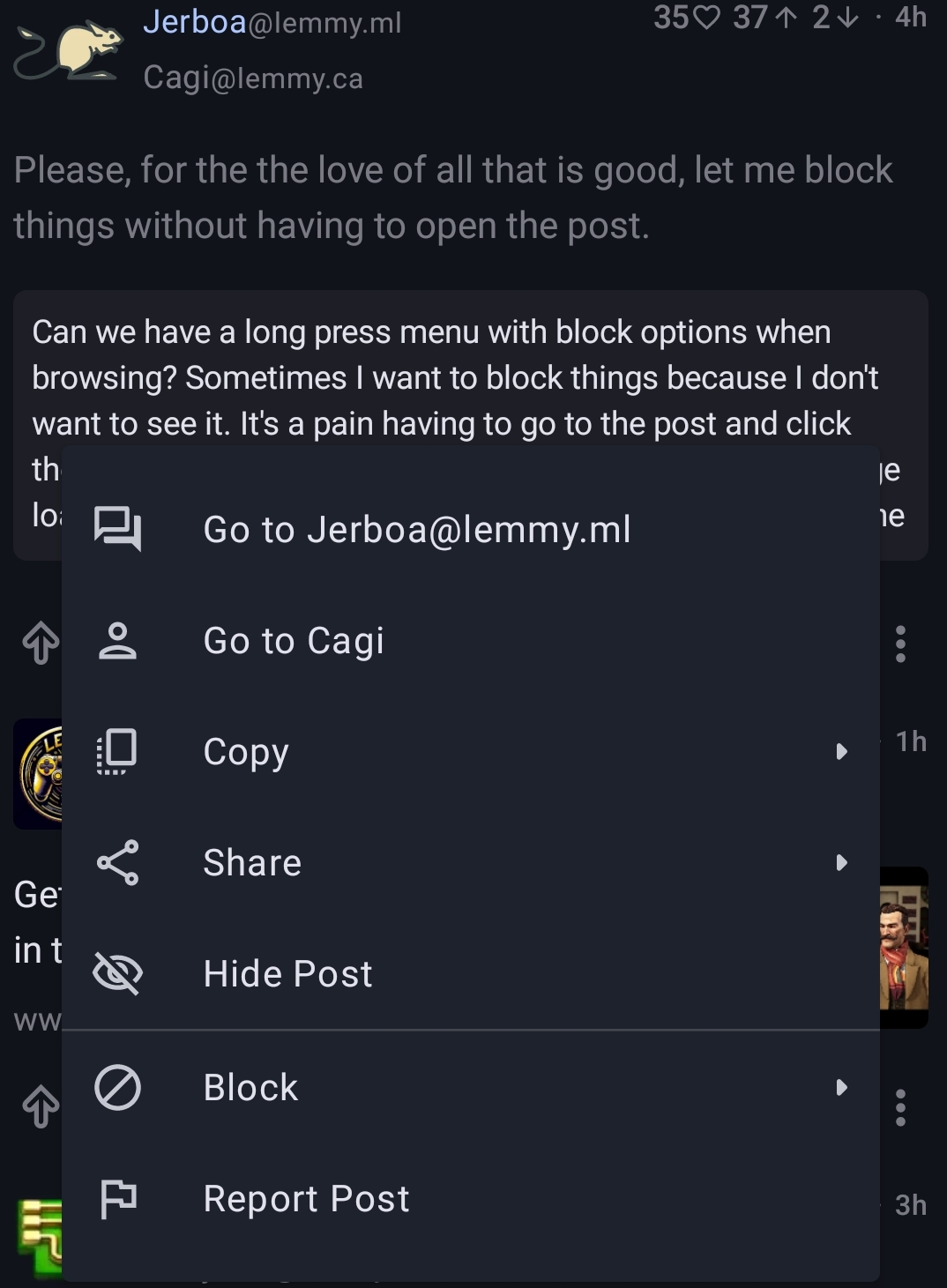
Can we have a long press menu with block options when browsing? Sometimes I want to block things because I don’t want to see it. It’s a pain having to go to the post and click the options to do it. Or rather try to click it, but then the image loads, displacing the load button, so you accidentally click the image instead, getting it unblurred, in full screen. Literally the very last thing I wanted.
I assume you mean blocking a specific post from being seen rather than blocking the user who posted it because in the latter case you can use the three dots to the bottom right of a post. As far as I am aware there isn’t a way to block specific posts at all? Do tell if there is.
I think a good implimentation would be keyword filters but the ability to conveniently remove posts from our feeds without seeing them would also be great for those of us who are more content sensitive. You should make a request on the github page.
I do mean blocking users and communities. The three dots only exist in card view, and I hate that view.
Completely off topic: Your username gave me a chuckle that I quite needed. Thank you.
Not exactly the convenience sought, but in Settings there should be Blocks page where one can block users, communities and instances. Only it has to be manually typed and then selected. These blocks should also be transferred if one changes instances.
You can use the small card post format
I hate that format.
Or Card post format, with long actionbar.


This is a fantastic request. I, unfortunately, do not need any type of daddy in my life at this time and it’s rather difficult to block them in all without going to the post or community.
…daddy?
I think I’m out of the loop here.
I think they’re pointing out the kind of porn posts they do not wish to encounter but are forced to in non-card mode.
The joke was too subtle, but they’ve got the spirit.
Yea that sounds like a report to me.
I think you need a daddy in your life
This already exists.
In list view, not cards? How? I try long pressing posts, swiping them, every input method I can think of.
Not in list view, as that’s a compact view that doesn’t have an action bar like the others.
This is why I request it. I hate card view and will never use it. A long press menu or a swipe menu takes no physical space on screen and ads extremely useful functionality.


