This one is super old and still references Reddit. A kind soul tried making a custom banner for us a while back, but I didn’t get much feedback when I posted about it so I just left things as they are and procrastination took over. I need help. I have zero artistic ability, and suck this sort of thing.
MS Paint. Mouse only.
Too credible I made my work computer background in ms paint lol
pics or it didn’t happen
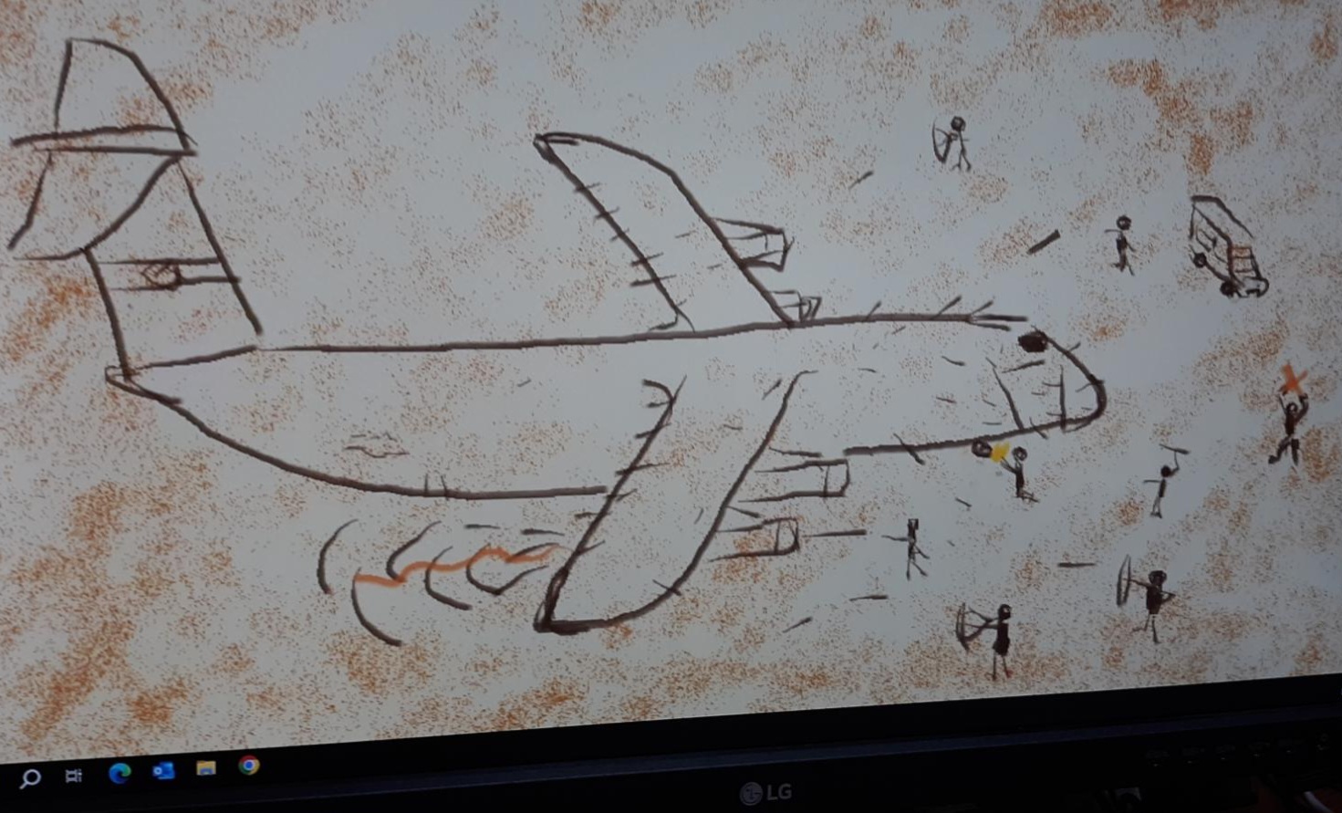
That C-130 needs a shave. Otherwise, 10/10
😙👌
Put some planes without clothes on it
T I D D I E S
AND NACELLES
Please, I can only be so erect.
I don’t think that it’ll likely hit that level, but note that sh.itjust.works has an instance rule against pornography (which is certainly not strictly adhered to, probably not even in the past image submissions on this community). But just saying, given that a community banner image is probably higher-profile than a one-off image submission.
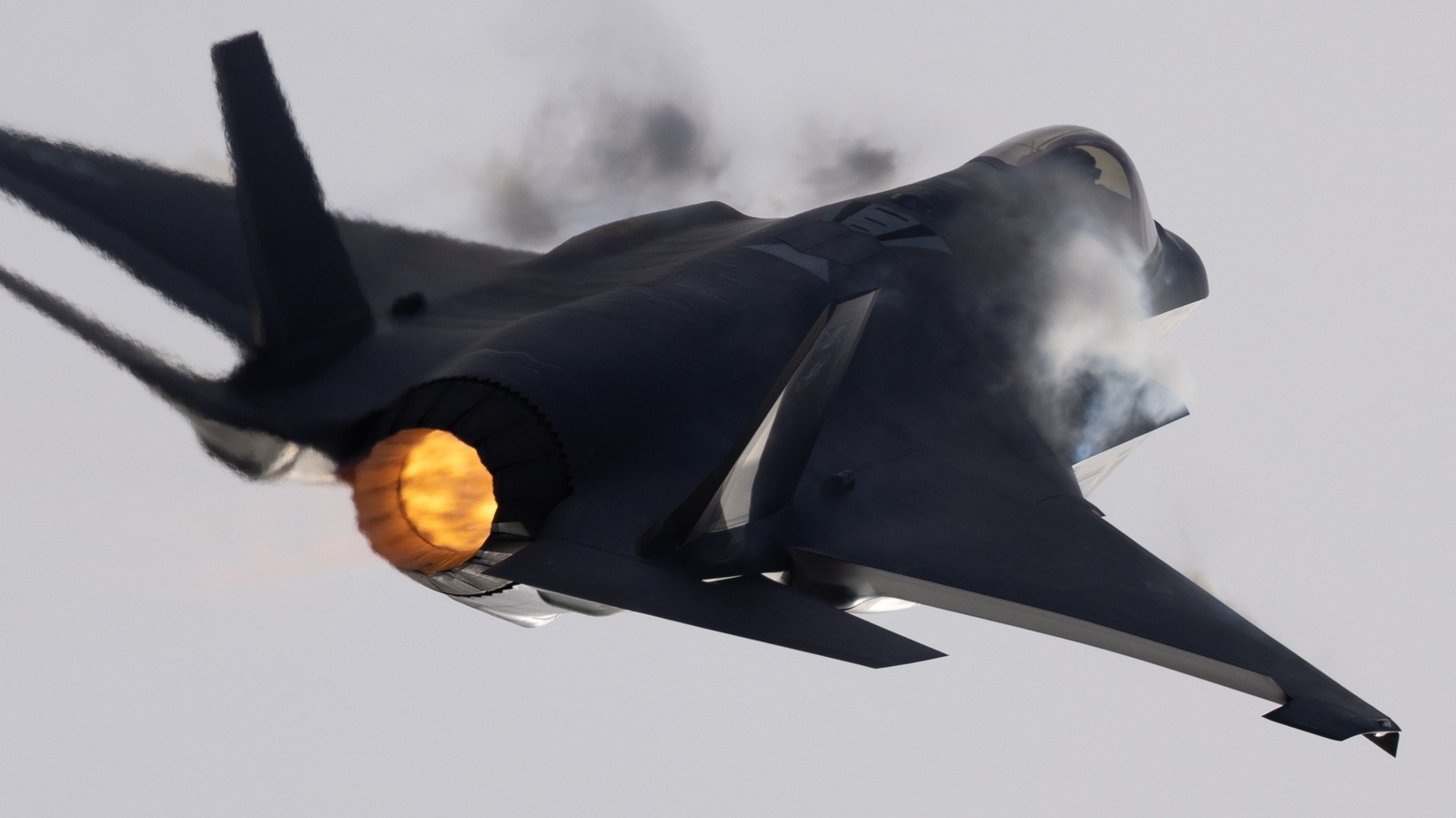
This is porn to me.
So hot
T I D D I C E L L S
Give em a little bridal garter on their landing gear
You probably want to list your desired resolution.
Look, I already told you I suck at this (I’ll find out)
Edit: 960x240, 4:1 ratio appears to be right answer
960x240 is what one post said
investigates
In my web browser, browsing the lemmy.today Web UI, looking at the homepage for the community, if I take a screenshot, the current banner appears to be displayed at 966x129; the actual underlying image is 4,000x533.
Looking at a different community’s banner [email protected], I get 966x240 visible in a screenshot, with the underlying image being 1,792x672.
So at least on my browser and viewed on that Lemmy frontend, I’m a little suspicious – without looking at the code – that 966 might be some kind of native target for width. It can clearly handle higher-res, and that might be desirable for some higher-resolution displays or clients, if they leverage that.
EDIT: Man, this should be on some kind of Lemmy community moderation wiki. Like, every moderator shouldn’t have to individually figure this out.
EDIT2: One reference to 960x240 that I can find is here, though as I said, it doesn’t appear to be quite right for native display resolution – on my browser, maybe just something wonky with me – and in that post, they point out that different themes can take advantage of higher resolution.
EDIT3: In the CSS, at least in the current default Lemmy Web UI, it looks like
.bannerhas amax-heightattribute of 240px, so I think that it’s safe to say that at least in that environment, it won’t grow past that.The Lemmy mobile apps probably also handle banners differently
I will zap you with my zat if you don’t have an amazing Cake Day!
Aww thanks, I will indeed!
at least a 5/10 if you want to be half way decent
The current community rules require sourcing images used in art; Rule 8. Note that images from the US federal and state governments – which include a lot of official military images – are very commonly in the public domain and can be freely used. The Department of Defense explicitly places imagery without specific restrictions in the public domain.
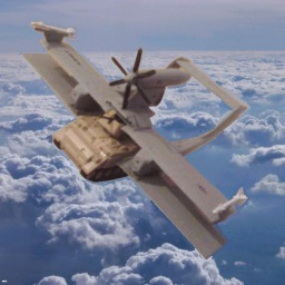
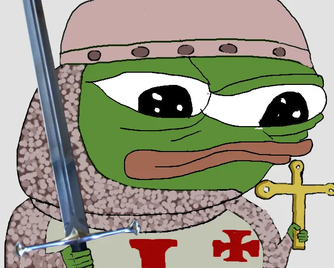
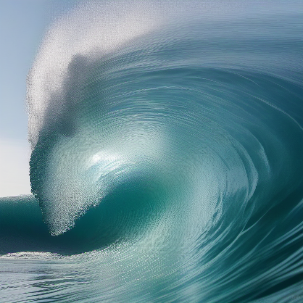
The crowd over at [email protected] generates images constantly, so if you’re up for an AI-generated image – which might permit for something with a more-cohesive feel than an image montage, might cross-post there to ask for submissions, get stuff maybe more like this:

The existing banner appears to be a montage of images that were previously posted to /r/NCD. Like, the Democracy is Non-Negotiable image appears to be a rescaled version of this:
https://old.reddit.com/r/NonCredibleDefense/comments/yifpm6/3000_blatant_propaganda_pieces_of/
Could patch together something out of those posts.
I prefer the old one over anything ai generated tbh
Well, it sounds like the existing one’s changing. You willing and able to hand-create and contribute something worthwhile yourself? If you’ve got a personal objection to generated images, that’d be a constructive way to provide a viable alternative.
No planes without clothes in this one. It’s a no from me dawg.
Yeah, this is our one chance to be family-friendly before being banned for something or other. This grease trap dweller under the Pentagon votes “modestly clothed”.
Why would a plane need clothes? You ever seen an F16 wearing pants? Get outta here with that shiz
🎶 One of us, one of us, gibble gabble, one of us, gibble gabble 🎶
