Back in Apollo, we had a feature where you could long-press on mobile and save a screenshot with options to include usernames, number and levels of parents, and original post, amongst other things. Those were the ones I used. I also remember there was a checkbox for watermark, which defaulted to on, and which I never touched but always respected, because it never condescended to me.
Anyway, I used that feature so much that there was no Apollo without it before the ensittification.
As a user experience designer, Apollo had done a lot right that the big tech names had been doing wrong, and I’d floundered on Lemmy until the Voyager team started from that foundation.
I appreciate everything this team has done for me, but I do miss this feature. It seemed aimed straight at me, so I almost hate to bring it up, but it was beautiful and I loved it.
(I’m sorry for not saying this on Git, but I just can’t right now)
eta: you guys are the best. I love everything you’ve done. <3
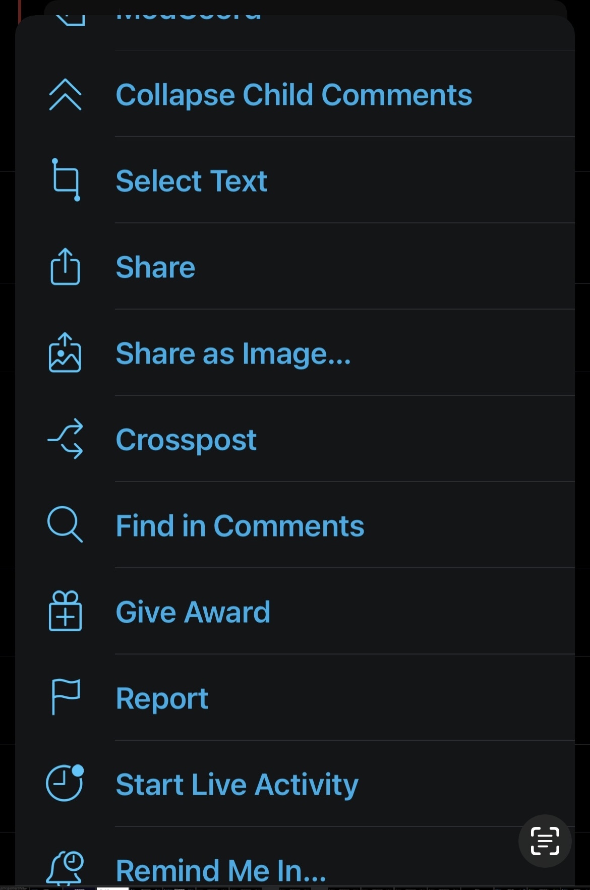
It’s already incorporated. Tap the 3 dots at the end of the comment chain you want and tap share as image.
Oh wow, thanks! I’d never have noticed it there.
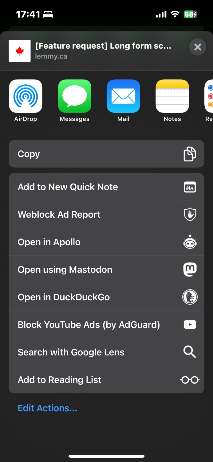
So I guess my request is to add it to the share menu, here:

That’s not how Apollo did it though. Or am I wrong?
They may have had the option in more than one place. That’s how I always accessed it – I may be misremembering. I was going off muscle memory, because that was a feature I used a lot.
Now going through my old Apollo screenshots (I screenshotted literally everything in the UI before the app went down), it looks like you may be right?

I think I used long-press to get to it, but I guess it’s been too long. As a UX designer, I’d still recommend adding it to the share menu, though, because it makes logical sense there.
Can you put app specific features into the iOS share sheet? Generally that menu sends you elsewhere.
You can provide app-specific activities that can appear in a share sheet when people open it within your app or game.
You can also create app extensions to provide custom share and action activities that people can use in other apps. (An app extension is code you provide that people can install and use outside of your app.) For example, you might create a custom share activity that people can install to help them share a webpage with a specific social media service
Nice, wish more apps took advantage of that.
Actualy, now I’m back to muscle memory rather than over-thinking it, it’s the long-press on comments I’m missing. I tend to long-press things to bring up context menus rather than trying to hit the little dots in the comment header, because I fat finger things and just wind up collapsing and expanding the comment instead. (Yes, I know I can turn that off, but that makes other interactions much worse.)
I much prefer long-press for context menus, and there’s no long-press menu for comments at all.
I realised today that I’ve gone back to the old days of taking multiple screenshots with my phone, stitching them together, then sending several pictures instead of having one easy screenshot of a conversation. I guess I do it rarely enough normally, and more in an election year.


