

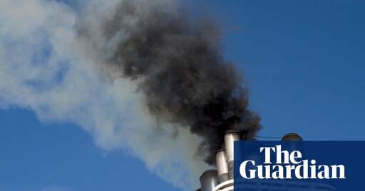
A new analysis by Hansen and colleagues concludes that both the impact of recent cuts in sun-blocking shipping pollution, which has raised temperatures, and the sensitivity of the climate to increasing fossil fuels emissions are greater than thought.
The group’s results are at the high end of estimates from mainstream climate science but cannot be ruled out, independent experts said. If correct, they mean even worse extreme weather will come sooner and there is a greater risk of passing global tipping points,
Evwrtyhings on course for the collpaee if civilisation under the weight of human stupidity :)
I’m not convinced this plot bears much relation to the Hansen et al paper. The plot combines SSPs - socioeconomic scenarios, RCPs - levels of ‘radiative forcing’ (all gases together - the numbers 1.9 to 8.5 are RF in W/m2) and temperature.
Hansen et al (OP) are suggesting that the climate sensitivity may be higher than the IPCC range, which would imply a higher temperature for any given RCP level. This suggestion is derived from the recent history of aerosols and temperature, as I discuss in another comment (above/below?).
However this doesn’t change which curve we are on (in reality none of them), as the big difference between curves is from projections of future emissions depending on technology, population, policies etc. Also the near-term projections have little relation to the long term, due to inertia but also the range of different models and assumptions used to make them (some years ago). So you can’t look at very recent data to derive which curve we are on.
I was (years ago) part of the process that designed the IPCC scenario structure of splitting the SSPs from RCPs, to allow the two modelling groups to work in parallel rather than one waiting for the other, so they could get on with connecting feedbacks (not sure this happened…).
But IPCC ends up re-blending too many varying factors in one plot, because they have page limits, which can be somewhat confusing. Work of 10,000 scientists over six years condensed into one summary report… - is that the most effective method of communication ? That’s why I prefer to make an interactive model.
Fundamentally, the useful question is not ‘where are we going’ but ‘where do we want to go’ - taking into account all the feedbacks and inertia in the systems, but making choices about our common future. To get to the lowest (1.9) curve we’d need a global green revolution tomorrow, but it’s not physically impossible. As for the 8.5 curve it’s very unlikely it’s part of the set as similar to earlier high-end scenarios run by IPCC since 1990s, which might have happened if we’d stayed in the coal age (still useful for comparing the high end of the physical models). The others are still in play. Extrapolating current trends and policies (especially tech and popn in China) I’d say the most likely is somewhere between 2.6 and 4.5 curves, but we could do better. While if you are building sea-walls you should anticipate worse. But don’t be fatalistic, we still have many options.
[ Side remark in response to comment - as for Jan 2025, it’s really not ‘climate’ to conclude anything from one month. Even the El-Niño cycle depends on heat transfer between surface and deep ocean, which is a slow process, you need to integrate over much longer time. There may be a warm anomaly recently in tropical oceans, and also the high-arctic, but it’s actually quite cold where most northern people live (due to Rossby waves whose amplitude is increasing, as we expected in an hand-waving kind of way). ]
You are of course much more technically correct in pointing out that if Hansen et al are correct, what that means is functionally all RCPs, as plotted in the graph I picked from the IPCC report, basically shift upward, or climb faster.
But I do not have the ability to run all the models and plot my own graphs and label them properly, I just have a shitty phone.
I also had a career in general data analytics, and sometimes, quite often actually, nobody understands what your data visualizations mean if they are too complicated and can’t be explained with a fairly simplistic narrative.
So basically, the ‘revised’ RCP 2.5 - 4.5 line, just shifts to roughly where the ‘unrevised’ RCP 5 - 8.5 line is now, if Hansen et al are correct.
In terms of visually displaying the concept that ‘we are actually overly optimistic in our future temperature projections’, I feel that what my original post said and displayed is basically accurate and conveys this to a lay reader, again, best I can do on a phone.
As far as the actual empirical/theoretical validity of this view?
Well here’s Paul Beckwith going through Hansen et al’s recent paper.
www.youtube.com/watch?v=ZplU7bJebRQ
The jist of the argument seems to be twofold, first, that removing sulfur from the fuel of transoceanic shipping vessels has lowered the amount of negative or downward atmospheric forcing.
Beckwith says the IPCC has a climate sensitivity for a doubling of CO2 is about 3C, Hansen says its about 4.5C.
Further, the second major point is that IPCC seems to have rejected Hansen’s older, higher estimates of the effects of arctic freshwater ice melt forcing in their models…
… but, actual, observed arctic ice melt seems to be double what even Hansen’s older paper estimated, meaning the IPCC models are very significantly underestimating that.
As to you saying that the El Nino temp from one month isn’t a good point to use to indicate overall climate… yes, but the El Nino temp is significantly higher than what we should expect from the existing Nino3.4 model, it appears to have broken away, upwardly, from the model.
I should have been more clear about that, my point is that it is so significantly higher than what we expect, that it is yet another indicator that existing models are too optimistic, too constrained in terms of overall temp outlook.
…
Beckwith, himself, in this video, says he would expect us to hit +2C within a decade or less.