carrylex@lemmy.world to memes@lemmy.world · edit-27 个月前Has to be those frozen wind turbines and solar panels...lemmy.worldimagemessage-square101fedilinkarrow-up1414arrow-down122file-textcross-posted to: [email protected]
arrow-up1392arrow-down1imageHas to be those frozen wind turbines and solar panels...lemmy.worldcarrylex@lemmy.world to memes@lemmy.world · edit-27 个月前message-square101fedilinkfile-textcross-posted to: [email protected]
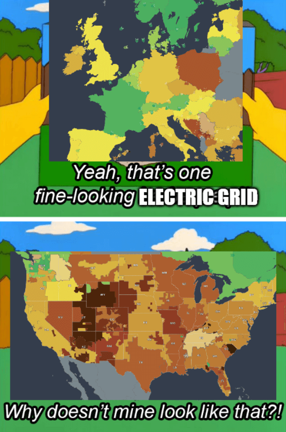
Template Source - The colors of the grids represent CO2 emissions The title is a reference to the 2021 Texas power crisis
minus-squareTunaCowboy@lemmy.worldlinkfedilinkarrow-up1·7 个月前Makes sense when you realize 12% of Americans live in CA, vs somewhere like WY where 0.17% of Americans live.
minus-squarepyre@lemmy.worldlinkfedilinkarrow-up1·edit-27 个月前what i meant was there producing more carbon emissions. you would expect more populous areas to produce more carbon emissions


Makes sense when you realize 12% of Americans live in CA, vs somewhere like WY where 0.17% of Americans live.
what i meant was there producing more carbon emissions. you would expect more populous areas to produce more carbon emissions