- cross-posted to:
- [email protected]
- cross-posted to:
- [email protected]
Hi lemmings, I switched over from Reddit 10 days ago now but I couldn’t find a mobile client that I was happy with with an experience similar to the Reddit experience I was used to. So I decided to build my own and I hope you will like it as well!
Play store link: https://play.google.com/store/apps/details?id=com.kuroneko.lemmy_connect
Features:
- Material U
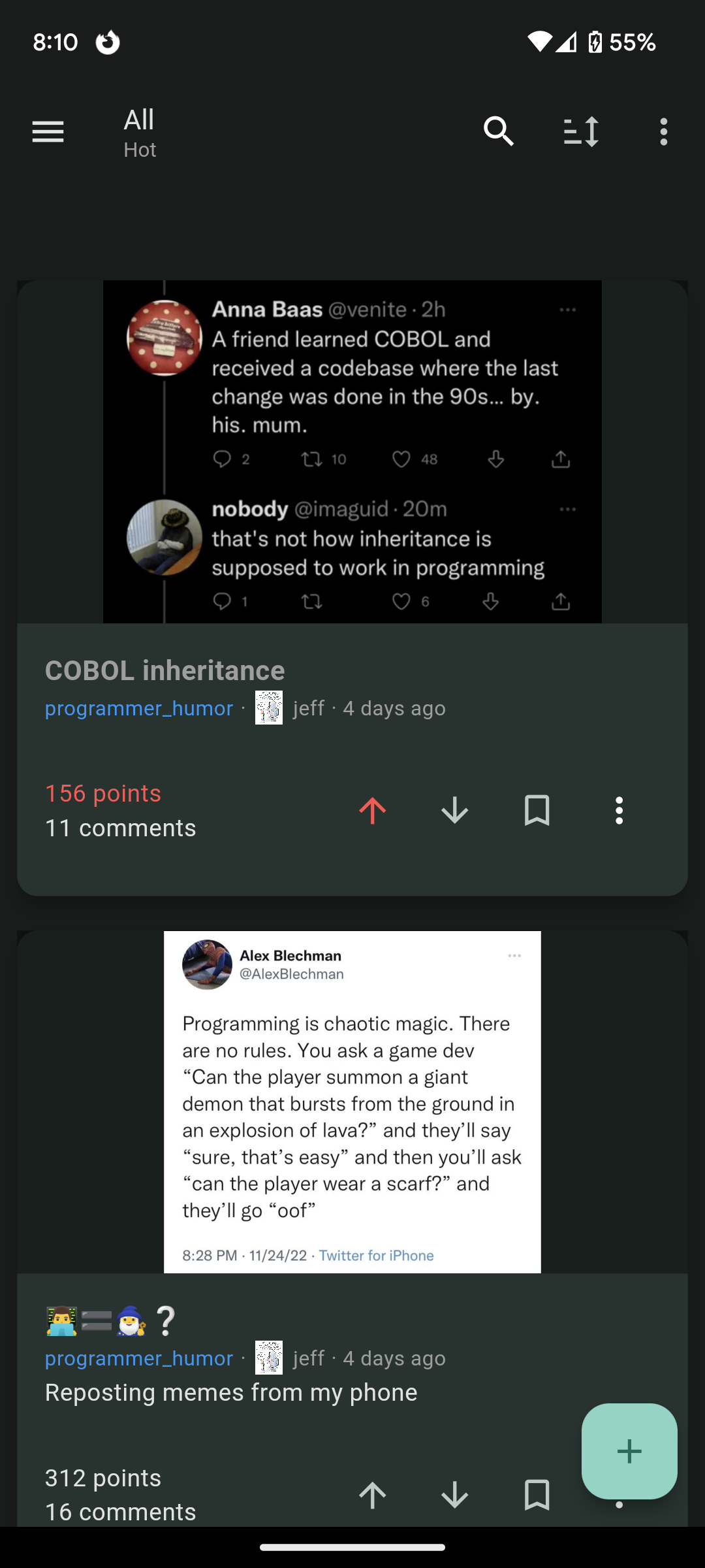
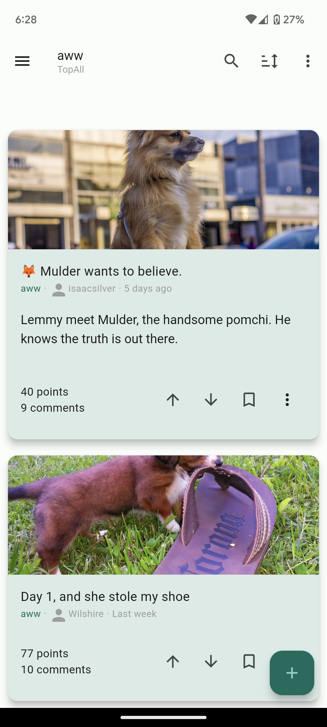
- Dark and Light themes
- List view / Card view / Fullwidth view
- Filter lists for hiding posts
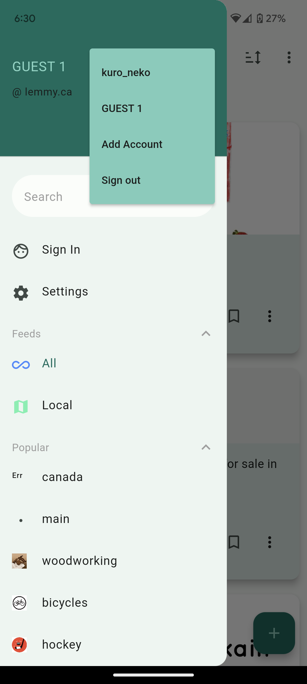
- Multiple accounts + switcher across multiple instances
- Guest accounts for viewing an instance without signup
- Search and community autofill
- Markdown support + attempt to navigate links correctly (/u/foo will open that user instead of browser kickout. Same for /c/, !, and @)
- Saving posts
- full sort types
- NSFW view options (hide, blur, show)
- copy text and url on all posts and comments
- add comments, replies, and new posts
- comment replies with line indicators
Here’s other screenshots:


Future plans:
- Improving the inbox
- Swipe actions
- Multi-~~reddit ~~communities
Thank you for taking a look. I hope others who are migrating from Reddit like me will find the app useful and I’d love to know your thoughts!
Edit: Community for the app is here: https://lemmy.ca/c/lemmyconnect


so far I’m really liking it. I would like alternating backgrounds on comments just to help separate them out a little.
I also really like the colored line on the side of comments that the pwa has to help you be able to easily see comment chain depths at a glance.
Hi, thanks for the feedback and I’m glad you’re liking it! I’ve added some more spacing between comments on the latest release which should help to separate them. Please let me know what you think! Also added the ability to edit comments.
Yeah that’s a lot better. I do think that you should make the names, points, and time a different color to make the poster information more prominent. Also would help it stand out a little better